
CO Voters for Animals
For my second group project case study, I worked with 3 other UX/UI student designers to create a mobile and desktop redesign of a local non-profit website.
We created a responsive web design based on survey data and insights from our stakeholder interview.
Project Overview
Our mission is to help spread awareness for the cause of the Colorado Voters for Animals by giving this website a facelift in terms of organization, website traffic, information sharing, and donations. All of us care about animals and have a common interest in their safety. It seems as though this nonprofit does fantastic work for the state but their website needs a better aesthetic in order to reach more demographics.
Tools Used
Figma, Paper & Pencil
Role & Responsibilities | Team
UI Design group project
Jacqueline Kharouf, UI designer
Chris Dunwoody, UI designer, email: cdunwoodyvoc@gmail.com
Taylor Knauff, UI designer, email: taylormichelleknauff@gmail.com
Jon Knauff, UI designer, email: jon.knauff@comcast.net
Timeline & Scope
June 18 - July 11, 2024
Empathize
• User Research Plan • Proto-persona (2) • Interview plan and questions • Heuristic evaluation • Hypothesis statement • Survey

Proto-personas
In our initial, brainstorming stages for this project, we decided to develop two proto-personas. One (Barbara) represents the retirement-age Colorado activist, similar to many current members of the CVA board; and the other persona (Colton) represents younger and more rural Coloradans who often own ranches or farms and wish to continue a family legacy of living off the land.

Survey Data
For the majority of survey participants, animal adoption programs were the most prevalent reason to visit the CVA website.

Define
• User interviews and transcripts • Stakeholder interview and transcript • Affinity diagram • User persona • Empathy map • User insight

Stakeholder Interview
To develop our user insight, we spoke directly with a stakeholder. I interviewed Roland Halpern, the executive director of CVA. In his 1-to-1 interview, Roland specifically mentioned the type of users who visit the site, the main focus of their work at CVA (mainly education and activism), as well as improvements he would like to have on the site (if he could afford such changes).
User Insight
After considering the feedback from our survey and the insights gained from our stakeholder interview, the website could be re-focused as a rallying place for ideas and collaboration (rather than membership and awareness). It could become a centralized location where lawmakers, activists, and supporters meet and create real solutions to preserve and protect animal rights in Colorado.

Empathy Map
In this empathy map, we considered the typical user's approach to animal rights activism, including how he or she might like to help, as well as the blockers that might prevent them from getting too involved.
Affinity Diagram
After pulling data from our survey and stakeholder interview, as well as online forums that rated non-profit organizations in Colorado, we noticed 5 emerging trends: the user's support for the mission of CVA, CVA's impact on laws and legislation, the disorganization of the website as a hindrance, the navigation issues on the site, and missing or incomplete website content.

User Persona
The typical user doesn't necessarily visit the site to become a full-fledged, annually-donating member. Users generally visit the site to be more informed, such as staying up to date on the latest ballot items, signing a petition, or learning how they can directly take action to defend animal wellbeing in their community. Ultimately, users go to the site for more information about animals’ rights issues.

Ideate
• Problem statement • Competitor analysis • UX hypothesis • Value proposition • User journey map

User Journey
Our user persona, Mabel, navigates a user journey that is sometimes frustrating (she must navigate many extraneous pages and steps) and unclear (she is not sure if she correctly completed the volunteer application), but she is resilient and determined to help.
Prototype
• User flow • UX scenario • Card sorting • Sitemap • Sketches • Low-fi prototype
Sitemap
A major part of our website redesign included a card-sorting group activity and a new organization for the information architecture. As a result, we created a more streamlined homepage main menu and sub-menus that fit under each main page.


Sketches
This is an example of one of the sketches that I contributed to the group project. We were still playing with the number of menu items to include in the main menu bar.
Test
• User testing plan • Usability test analysis or guerilla test analysis • UI style guide • Iterations based on user tests • Mid-fi prototype • Hi-fi A/B testing

Style Guide
We modeled our style guide on the current CVA logo because it includes all of the colors of the Colorado state flag. We picked colors with high contrast to stand out against the new colorful photography that we added to our redesigned site.
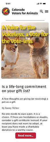
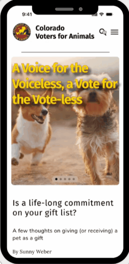
Iterations Based on User Tests
After a series of user tests, including A/B testing on two different versions of our mobile homepage and our desktop homepage, we made several iterations, including updating the location of key buttons, organizing information in interactive carousels, and consolidating our menu colors.


Conclusion & Future Opportunities
CVA has an important mission which could be more widely shared if this nonprofit had more resources and, perhaps, a dedicated media person on staff. As a volunteer-based organization, CVA is somewhat limited by the time and energy of its board members; however, there is so much potential for growing the outreach of this organization. One small step would be expanding the usability of its website.